On graphs
September 22nd, 2011 | Published in graphs
I’ve been working on an in-depth post for this blog about graph data and how to analyse it. That post is still unfinished but I’ve been posting pieces of work-in-progress on other sites during the process. Here are some pointers to bring them together: 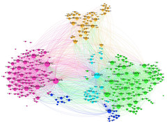
- A Flickr set of Gephi graph visualisations that analyse, cluster and visualise datasets from Delicious, Twitter, Dopplr and Wikipedia
- A zoomable exploration of the topics in the 2012 SXSW panel picker and some notes on how it was made.
- Visualising the whole world of conference topics with Lanyrd data
- Slides from an Ignite talk at Strata Summit NYC that uses Nokia geo data to draw a new map of the world: Place graphs are the new social graphs